Home › Guides › Business website examples
7 business website examples, with real screenshots
Every page below is a demonstration business, not a client — built to show the range of what a service-business site can look like, not to claim these companies exist. Each one is live, and each one gets something specific right that’s worth copying.
A good business website example isn’t a mood board — it’s a set of small, specific decisions: what the headline says instead of what it could have said, where the phone number sits, what counts as proof. Below are seven real, live pages built on our own pipeline, each one standing in for a different trade and a different way of making the same handful of decisions.
1. Brasscap Plumbing — Wichita, Kansas
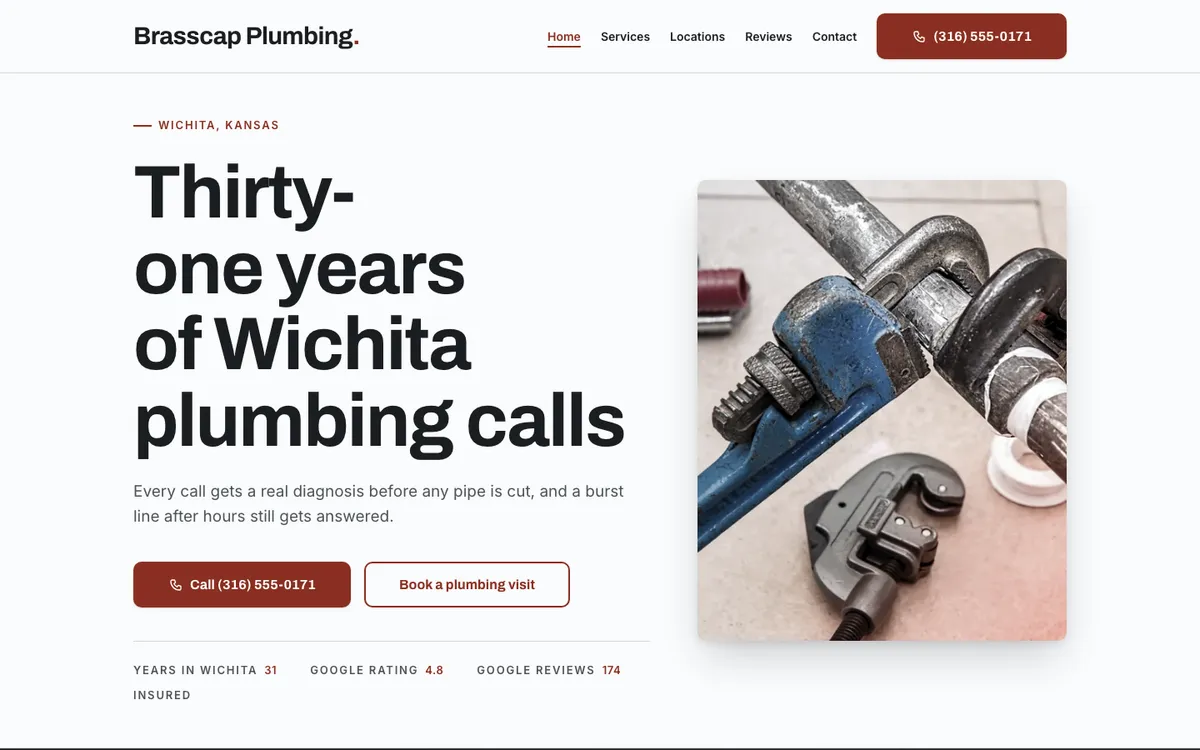
The subheadline does real work too: “every call gets a real diagnosis before any pipe is cut” answers an actual objection a homeowner has before calling a plumber, rather than describing the company in the abstract. View the live demo →
2. Blue Flame Furnace & Air — Fargo, North Dakota
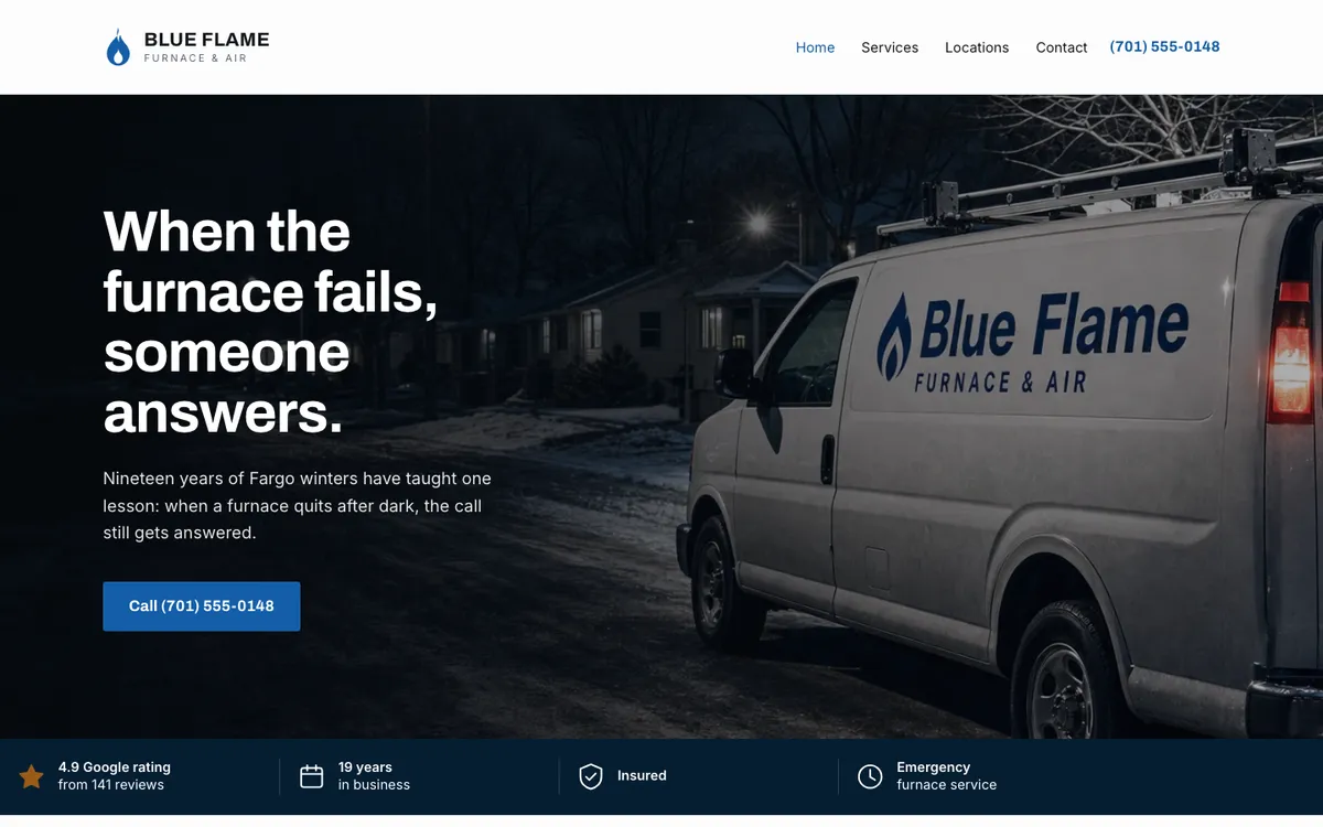
One call button, not three competing calls to action, and the stat band directly under the fold answers the four things a cold, worried homeowner actually wants to know before dialing: rating, years, insurance, and whether emergency service is real. View the live demo →
3. Sunshine State Air Conditioning, Heating & Indoor Air Quality Specialists — Florida
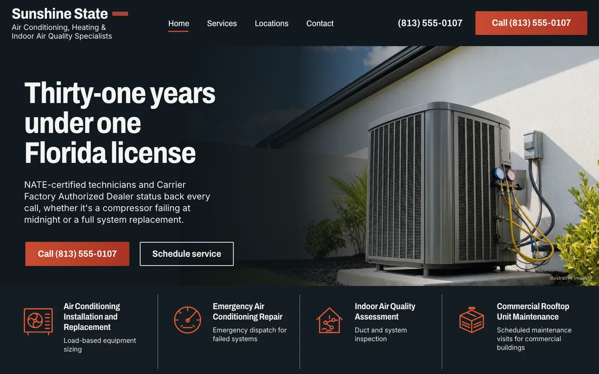
The subheadline names real-sounding credentials (“NATE-certified technicians and Carrier Factory Authorized Dealer status”) instead of a generic “trusted technicians” line, and the four service tiles below the fold split the business into distinct jobs — installation, emergency repair, air quality, commercial — each of which could become its own page. View the live demo →
4. Maple & Main Lawn Care — Burlington, Vermont
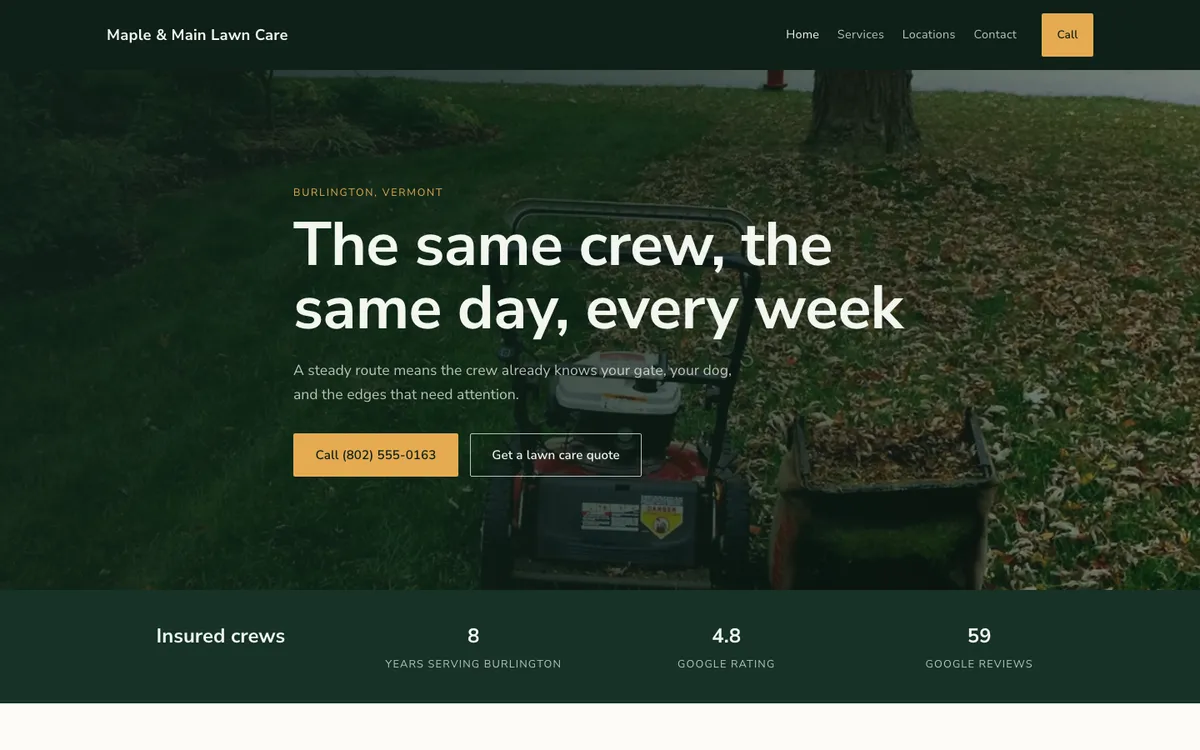
This is a good example of a headline that would look wrong on a plumber’s site and right here — it’s written around what a recurring-service customer actually worries about (a different stranger on their property every week), not a trade-generic promise. View the live demo →
5. Bright Path Landscaping — Phoenix, Arizona
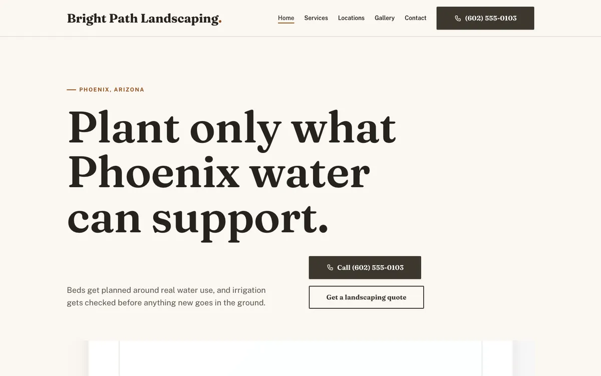
Notice what’s missing from the hero: no photo competing with the type. The page leads with a serif headline on a plain cream ground and lets the photography do its work further down the page instead of behind text it would have to fight for contrast against. View the live demo →
6. Oak & Iron Carpentry — Portland, Oregon
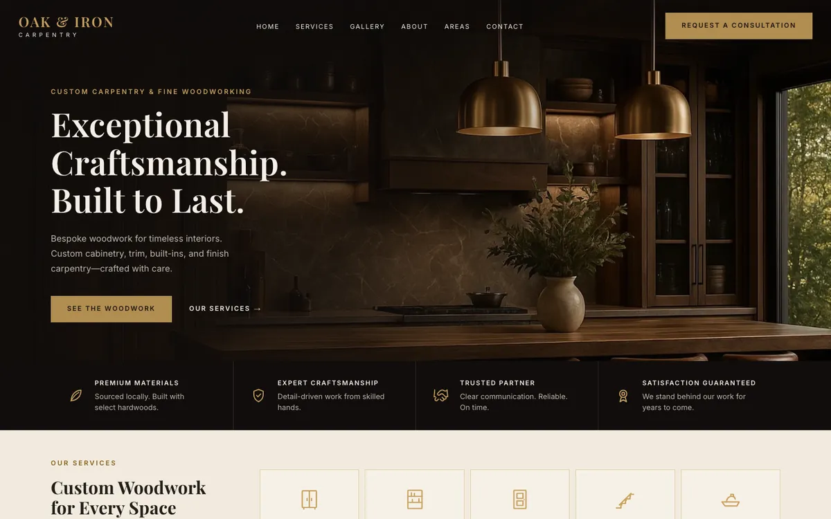
“Request a consultation” instead of “call now” is a small, deliberate choice — custom carpentry is a considered, higher-ticket purchase, and the call to action matches that pace instead of asking for an instant phone call. View the live demo →
7. Fox Hollow Fencing — Austin, Texas
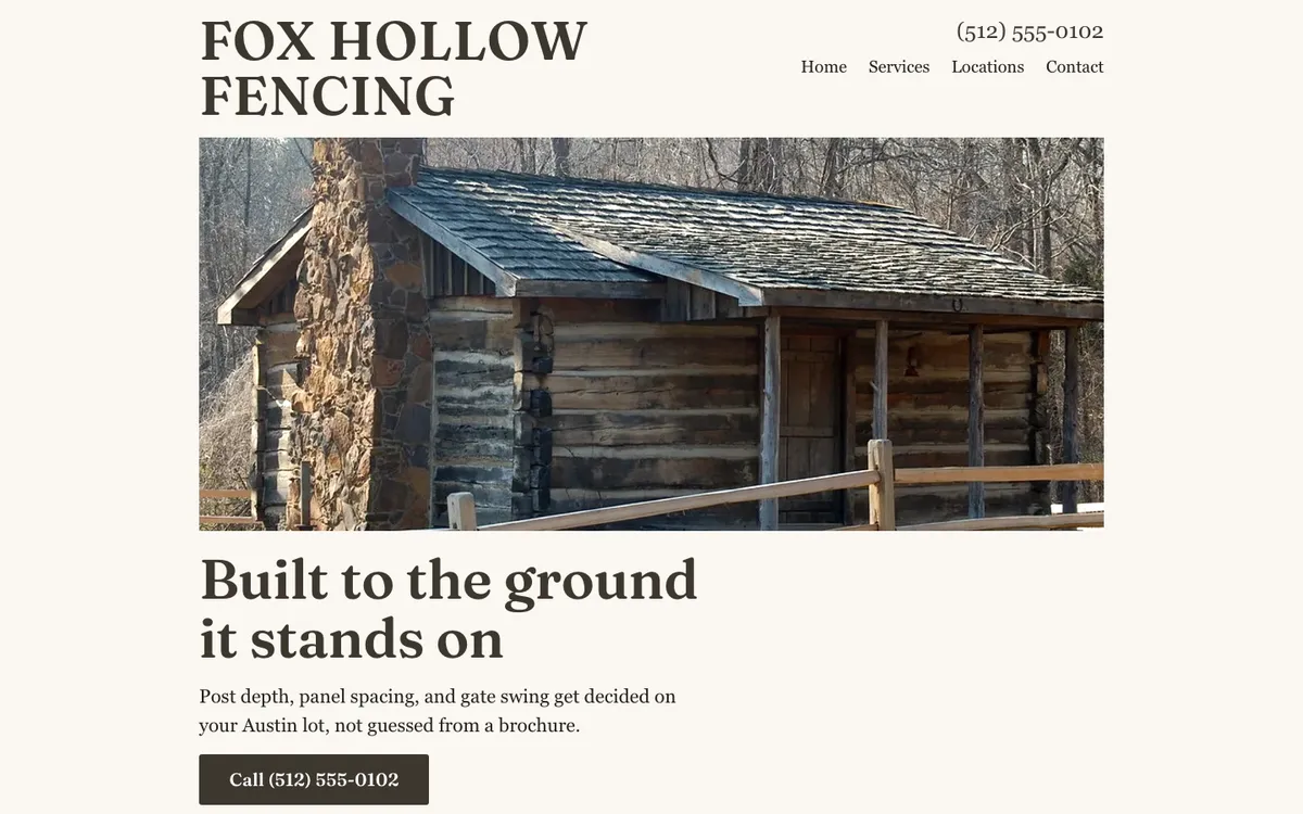
Just one button, no second option competing for attention, and the subheadline immediately backs up the headline with concrete, local specifics — “post depth, panel spacing, and gate swing get decided on your Austin lot, not guessed from a brochure.” View the live demo →
What all seven have in common
Different trades, different palettes, different headlines — but underneath, the same handful of decisions repeat on every one of these pages:
- The phone number is in the header on every page, not just the homepage, so it’s one tap away no matter where a visitor lands.
- Each real service gets named, not bundled into one vague “our services” paragraph — visible either in a dedicated grid of tiles or in distinct, nameable jobs in the copy itself.
- Service areas are specific cities and counties, not “the greater metro area,” because that’s what someone searching a city name is actually typing.
- No stock-photo hero where a real photo exists. The van, the kitchen, the mower and wheelbarrow, the cabin — every photographic hero on this page is standing in for an actual job, not a generic warehouse image of someone else’s crew.
If you want to see what this looks like for your own trade specifically, we’ve written dedicated guides for a few: plumber website design, HVAC website design, electrician website design, roofing website design, landscaping website design, and contractor website design.
Want a page like one of these for your own business?
We build a page for every service and area, a working quote form, and tap-to-call on every page — $0 today, the first 90 days free, then $99 a month.
Build my website